From Sticker to System
No brief.
No invoice. Just a belief the brand deserved it.
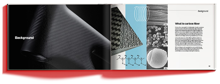
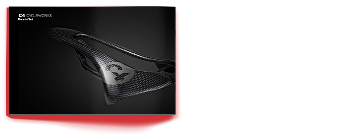
When I first found Max and C4 Cycleworks, the product was already speaking fluently: handmade carbon, serious riders, serious price tags.
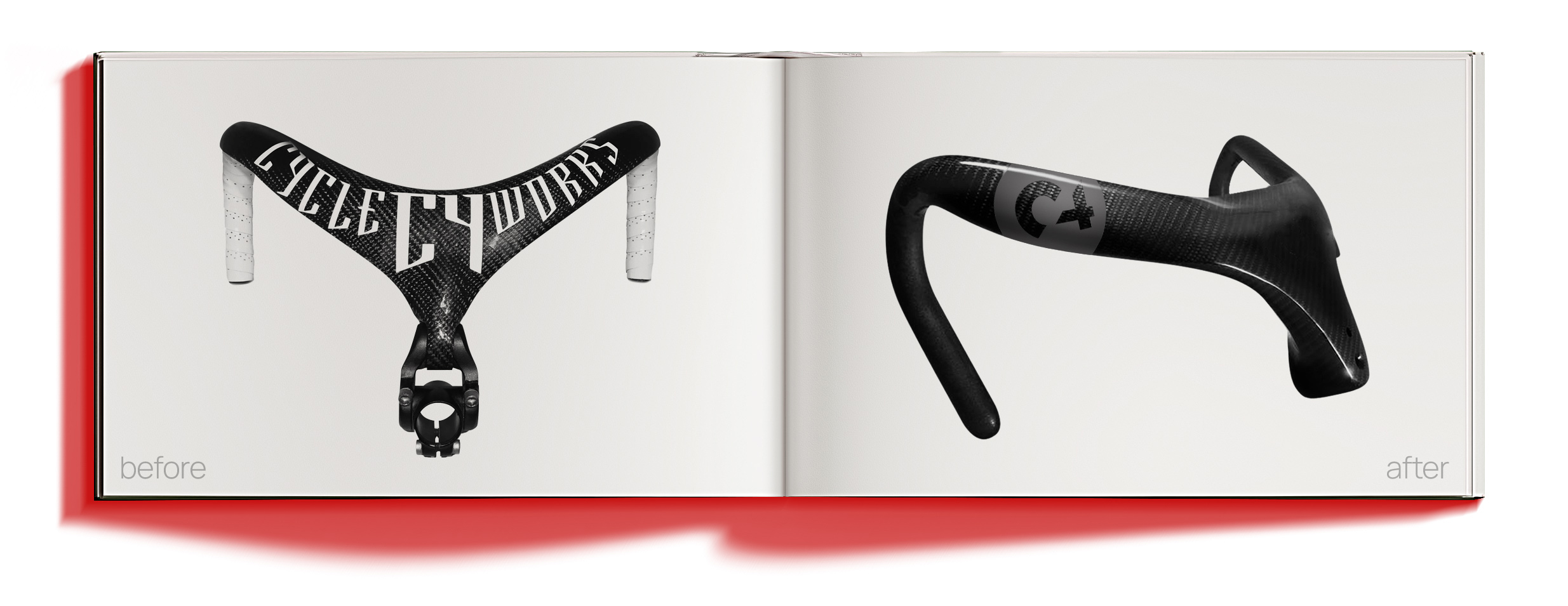
But the brand wasn’t. The original mark wasn’t “bad”—it was built for one job: live on the bar top and read fast. The problem was what happened when C4 had to sit next to names like Campagnolo, ZIPP, HED, FFWD—brands that look as premium as the parts they sell.
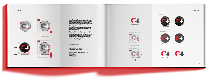
So I reached out. Not to pitch a trendy makeover—just to show what C4 could look like with the same discipline as the carbon. I built directions, listened, refined, rebuilt. It took a minute to land… until it finally clicked.
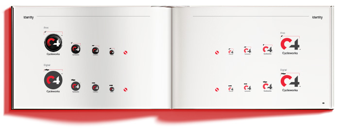
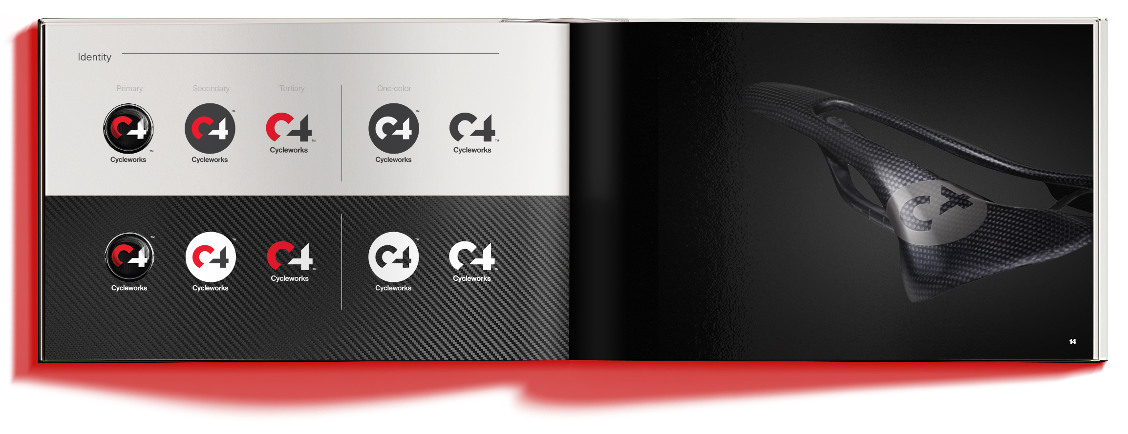
That’s when it stopped being a logo conversation and became a system.
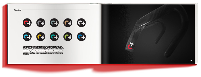
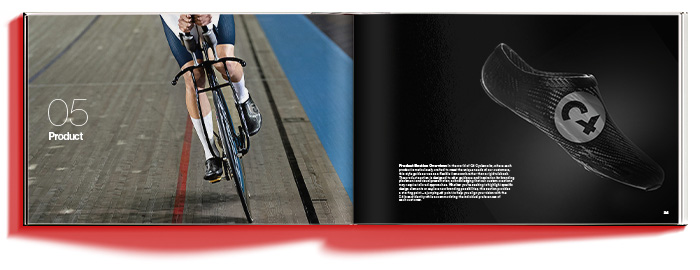
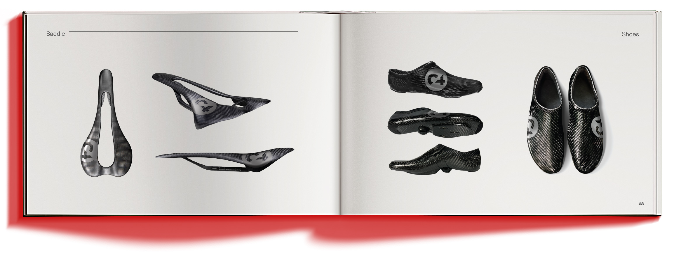
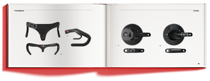
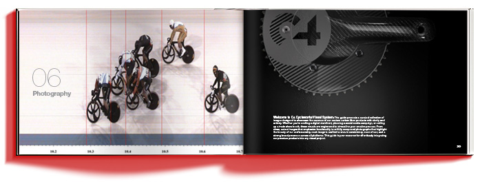
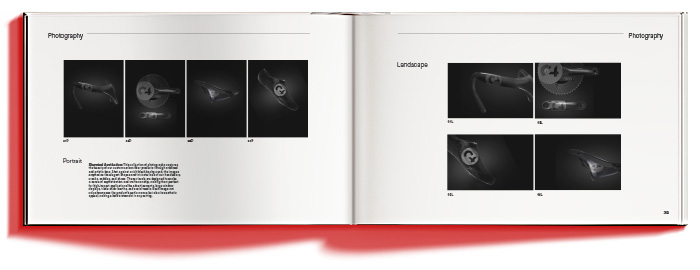
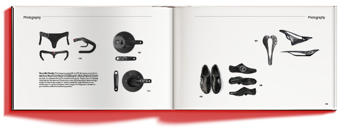
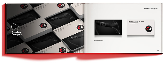
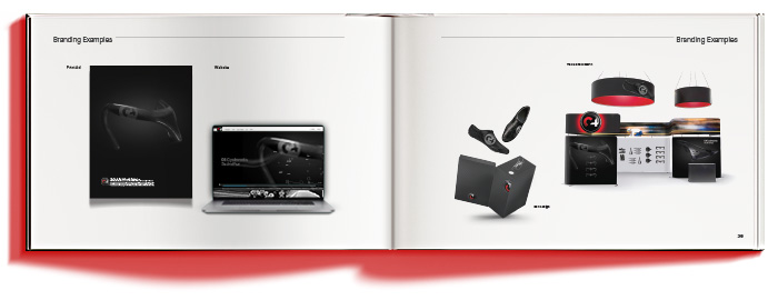
This is the C4 Visual Identity System: a flexible toolkit for a custom builder—quiet when the client wants stealth, bold when they want to announce themselves, premium either way. Mark. Type. Color. Photography direction. Real-world applications. The goal wasn’t rules for the sake of rules. It was consistency with range.
C4 started with bars and moved toward more ambitious territory. I built the identity to scale the same way—so it could stretch into whatever comes next without losing its voice.
And yeah, this one’s personal. I’ve always believed:
• What you put out comes back
• If you don’t have a great project, make one
• Your portfolio should point forward.
This was that—built in carbon language, translated into brand.